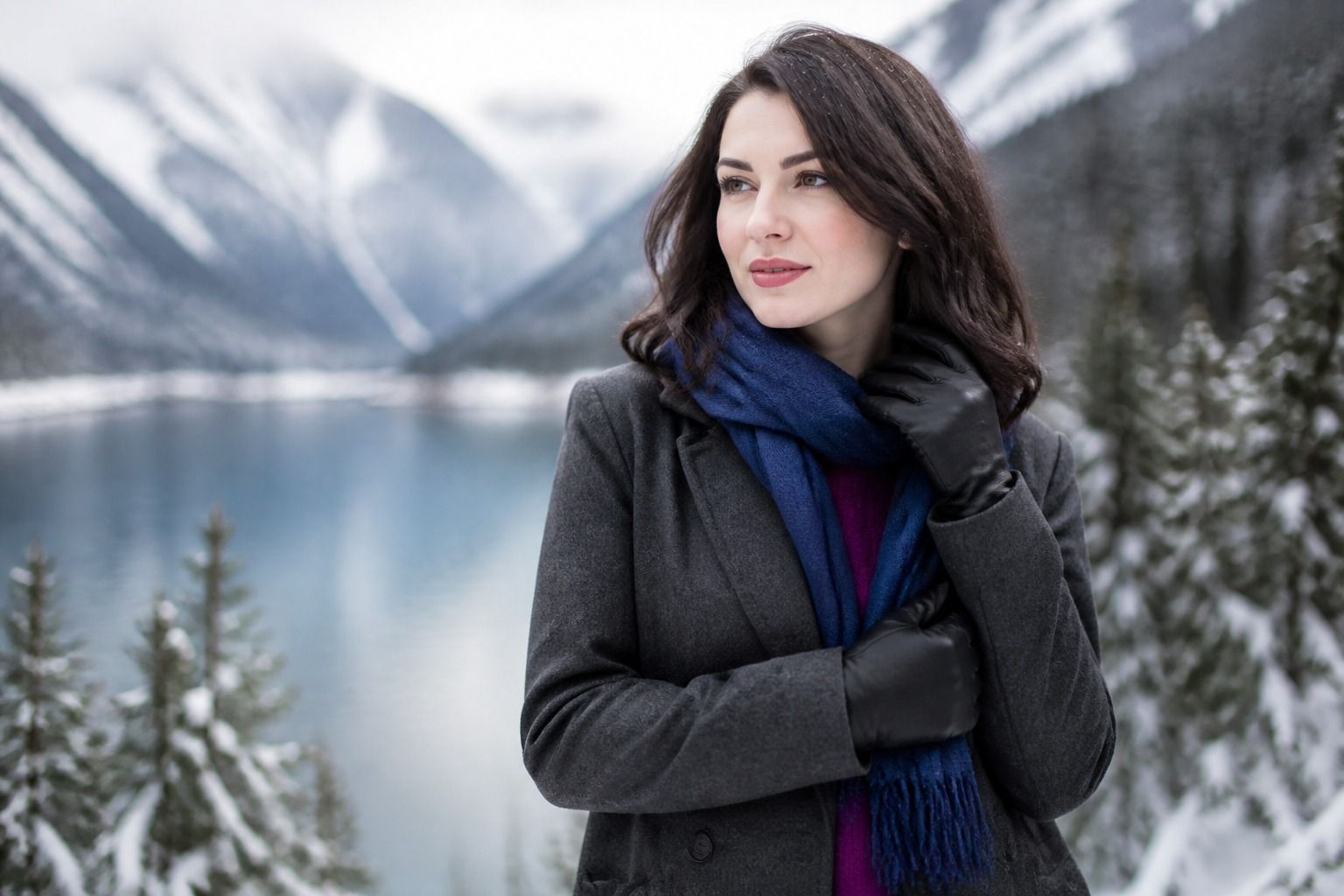
The 16-season system is easier to use when it is treated as a map of color relationships rather than a personality test with one answer. It starts with the familiar Spring, Summer, Autumn, and Winter families, then adds sub-seasons to describe the qualities that matter most near the face: temperature, lightness or depth, and clarity or softness. That extra detail can be useful when a broad season leaves you with a wardrobe full of colors that are technically close but still feel wrong. It can also create false precision if a quiz is taken under warm indoor light or judged from a single selfie. The sensible aim is not to earn a perfect label. It is to understand why certain colors make the face look more balanced and which neighboring options deserve a second comparison.
Why four seasons became sixteen
The original four color families are broad groups built around shared visual qualities. Spring is generally warm and clear, Summer cool and softened, Autumn warm and muted or deep, and Winter cool and clear or deep. Those descriptions are useful as a first pass, but they leave a lot of ordinary people between the headline examples. Someone may be cool enough for Summer yet too clear for its softest colors. Another person may suit Autumn warmth but need more depth than the lighter, gentler autumn shades. The 16-season system gives those border cases a place to be described without pretending that every face fits a standard sample.
The expansion is not four extra seasons added at random. Most versions choose a dominant characteristic and then connect it to a neighboring family. Light Spring and Light Summer share lightness; Soft Summer and Soft Autumn share muted chroma; Warm Spring and Warm Autumn share temperature. Deep Autumn and Deep Winter meet through depth, while Bright Spring and Bright Winter meet through high clarity. Different analysts may name a few boundaries differently, but the underlying idea stays stable: a subtype explains the strongest color quality and the family that supports it.
This matters when a shopping decision is more specific than a season label. A person told only Winter may buy black, optic white, and intense jewel tones, then wonder why some of them look heavy. A more detailed result might point toward Bright Winter, Cool Winter, or Deep Winter, each of which handles contrast in a different way.
The three dimensions behind each subtype
In practice, 16 season color analysis rests on three dimensions: undertone, value, and chroma. Undertone describes the warm-to-cool direction of a color. Value describes how light or dark it is. Chroma describes how clear and saturated it is, or how much gray has softened it. These dimensions overlap in real fabrics, which is why judging a shade by its name is unreliable. Dusty rose, for example, may be cooler and softer than a warm terracotta, but two garments sold under the same general color family can have very different value and chroma.
Undertone is usually the first filter, but it is not the only evidence. A cool color can still be too bright, too dark, or too gray. Warmth can be comfortable while the depth is overwhelming. This is why veins, jewelry comparisons, or a favorite lipstick should not decide the whole result on their own. They may offer a clue, yet draping fabric near the face shows more of the combined effect. Look for changes in the skin rather than for a dramatic preference: does redness become quieter, do shadows look softer, do the eyes appear clearer, or does the color start competing with the face?
Value is easy to miss when the color is attractive by itself. A light person is not automatically Light Spring or Light Summer, and a person with dark hair is not automatically Deep Autumn or Deep Winter. The relevant question is the relationship between the person and the color. Hold a pale tint, a middle-value version, and a deep version of a similar hue beside the face in the same light. If the light option makes the face look awake while the deep option pulls attention downward, lightness may be dominant. If medium and deep colors create a steadier frame, depth may matter more.
Chroma explains many of the results that feel confusing after a first seasonal color analysis quiz. Soft colors contain a muted, smoky quality; bright colors look cleaner and more energetic. A soft shade may flatter the skin while a vivid version makes every small flush more visible. The reverse can happen when a muted color makes a clear face look tired. Use fabric texture as a second check: matte wool, brushed cotton, and washed denim often reveal softness differently from glossy satin or highly saturated knitwear.
| Dominant quality | What to compare first | Common mistake |
|---|---|---|
| Light | Pastels and pale midtones against medium and deep versions of the same hue | Assuming light hair or fair skin is enough evidence |
| Warm | Warm and cool versions of a familiar color, such as coral and rose | Calling every yellow-based shade flattering |
| Soft | Muted colors beside clear colors with similar value | Rejecting a hue when the real problem is excessive brightness |
| Cool | Blue-based and yellow-based versions in equal depth | Letting a silver-versus-gold preference decide the result |
| Deep | Dark, medium, and light colors while watching facial contrast | Equating dark natural hair with a deep season |
| Bright | Clear saturated shades beside softened versions of the same colors | Confusing visual drama with a good near-face color |
How the sixteen sub-seasons are grouped
A useful way to read the 16 color seasons is to start with the four families and then notice the subtypes that sit at their edges. Spring commonly contains Light Spring, Warm Spring, and Bright Spring. Summer is usually divided into Light Summer, Cool Summer, and Soft Summer. Autumn often includes Soft Autumn, Warm Autumn, and Deep Autumn. Winter is commonly described through Deep Winter, Cool Winter, and Bright Winter. Some systems use slightly different names or add a neutral bridge, but this grouping makes the logic visible.
Light Spring and Light Summer are connected by value. Both can handle lighter colors, but Spring usually needs more warmth and clearer color, while Summer tends to prefer a cooler, gentler surface. A pale peach and a pale blue may both look delicate on a screen; beside the face, one may add healthy warmth and the other may drain it. That comparison is more informative than deciding whether the person looks generally fair.
Warm Spring and Warm Autumn are connected by temperature. They both tend to welcome yellow-based colors, yet Spring usually needs more brightness and a lighter range, while Autumn is more comfortable with earthier depth and muted richness. Compare apricot, clear coral, rust, and olive at a similar scale. If the warm family works but the dusty or heavy version dulls the face, the Spring side may be worth testing.
Soft Summer and Soft Autumn meet through low chroma. Both can work with softened colors, but Summer usually leans cooler and Autumn warmer. Mushroom, dusty teal, muted berry, moss, and softened camel can be useful comparison points because they reveal the temperature boundary without changing every other quality at once. The best result may be a palette that borrows a few colors from the neighbor while keeping the dominant quality consistent.
Deep Autumn and Deep Winter are connected by value. Both can support substantial contrast and darker colors, but Autumn depth often has warmth or an earthy cast, while Winter depth is cooler and cleaner. Charcoal, espresso, ink navy, deep olive, and burgundy can be compared in daylight. If black is acceptable but looks harsh, that does not automatically rule out Winter; the question is whether a cooler near-black, a warmer brown-black, or a softer fabric restores balance.
Bright Spring and Bright Winter meet through chroma. They can both carry clear, high-impact color, but Spring usually tolerates warmth and Winter usually needs coolness. A clear turquoise, vivid pink, tomato red, and blue-red lipstick make useful tests because their differences are easy to see. Brightness is not the same as wearing the loudest possible shade. A clear color that repeats the face is more helpful than a neon color that becomes the entire outfit.
Why neighboring seasons can both look plausible
Border cases are normal because human coloring does not stop at the edges of a printed chart. A result may shift between Soft Summer and Soft Autumn, Light Spring and Light Summer, or Deep Autumn and Deep Winter depending on the fabrics used, the lighting, and the person’s current hair color. A salon gloss, a tan, a strong foundation, or a phone camera can change the visible surface without changing the underlying pattern. That is why a single photo often produces confident but unstable answers.
When two seasons seem plausible, do not compare their most extreme colors first. Pick a shared hue and change one quality at a time. For Soft Summer versus Soft Autumn, compare a cool muted teal with a warm muted teal at a similar depth. For Deep Autumn versus Deep Winter, compare espresso with charcoal before reaching for pure black. For Light Spring versus Light Summer, place pale coral beside pale lavender, then check both against a neutral such as soft white. Note the specific effect: grayness around the mouth, yellow cast in the skin, sharper redness, loss of eye clarity, or a more even complexion.
Distance also matters. A color that fails as a sweater may work as a shoe, skirt, bag, or patterned accent. A difficult near-face color can sometimes be kept with a collar, scarf, or necklace between it and the skin. The 16-season system is most useful when it distinguishes priority from prohibition. A best color is one that repeatedly helps in a normal wardrobe; a less useful color is not a moral failure and does not need to be discarded immediately.
How to use a quiz without treating it as final proof
A color season quiz, including a 16 seasonal color analysis quiz, gives a shortlist; the inputs still matter. Start with a photo taken near a window in indirect daylight, without a colored wall reflecting onto the skin. Avoid a beauty filter, strong makeup, colored contact lenses, and a bright top that changes the apparent complexion. If the image is cropped tightly or the white balance is wrong, the quiz may be measuring the room and the camera before it measures you.
Read a 16 season color analysis test as a hypothesis. If it suggests Cool Summer, ask whether coolness, softness, and medium lightness all make sense when tested with fabric. If it suggests Bright Winter, compare clear cool colors against softened or warmer versions rather than accepting the label because the result sounds dramatic. A good quiz should give you a direction and useful comparison colors. It should not claim medical certainty, reveal an immutable identity, or make a single screenshot more authoritative than repeated observation.
For a practical test, collect a small set of real items: one warm and one cool version of the same hue, one light and one deep version, and one soft and one clear version. Stand near the same window, keep the camera and background unchanged, and place each item under the chin for a few seconds. Take notes before looking at the product name. The useful record is not I like this one. It is This one makes the skin look even, the eyes clearer, and the shadows less noticeable.
The final label should leave room for judgment. Use the dominant characteristic as the anchor, keep a few reliable neutrals, and borrow from the neighboring season when the temperature, value, and chroma still support your appearance. If two colors are close, choose the one you will actually wear and retest it in the setting where you dress: office lighting, outdoor shade, winter daylight, or a dim restaurant. The purpose of 16 seasons color analysis is a clearer set of choices, not another reason to distrust your own eyes.