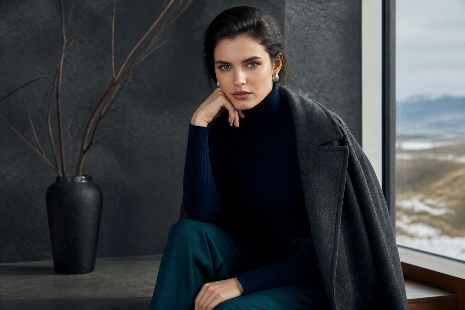
The Deep Winter color palette is often described with a quick list of black, white, jewel tones, and cool dark neutrals. That list is useful, but it misses the practical question: what happens when those colors meet an actual wardrobe, an ordinary face, and the changing light in a fitting room? Deep Winter is less about collecting dramatic shades than about keeping depth, coolness, and clarity in the same outfit. The palette can look polished in a photograph and heavy in a shop mirror if the contrast is wrong, the fabric is dusty, or the color is warmer than it first appeared.
What gives Deep Winter its depth
Deep Winter sits at the dark end of the Winter family. The most important feature is value: the colors have enough visual weight to hold their place beside black hair, dark eyes, strong brows, or a naturally high-contrast complexion. That does not mean every person in this season has very dark hair. A person with medium brown hair can still belong to Deep Winter if the overall coloring is cool and clear, and if dark, clean colors make the face look more awake rather than drained.
Cool undertone is the second filter. A deep red with a blue base usually behaves better than a rusty red; blue-black is more reliable than brown-black; blue-green emerald has a different effect from yellow-green olive. These differences are easy to miss under warm shop lights. I have seen a supposedly cool burgundy turn brick-red beside a window, which is exactly the kind of small shift that can make a palette diagnosis feel inconsistent.
The third feature is chroma, or clarity. Deep Winter colors are not necessarily neon, but they are clean. They have a defined edge rather than a grey veil. Ink navy, cranberry, bottle green, sapphire, icy pink, and blue-red all have enough clarity to create a deliberate frame around the face. When a color is deep but dusty, the result can look tired even when the depth is correct.
This is why dark hair alone is weak evidence. Hair color may be dyed, sun-lightened, muted by indoor lighting, or simply one small part of the overall picture. Compare a true black, a smoky charcoal, a warm chocolate, and an ink navy near the face in daylight. The right family usually makes the skin look more even and the eyes sharper. The wrong one may appear attractive on the hanger but leave a grey or yellow cast on the face.
The neutrals that carry the wardrobe
A Deep Winter wardrobe needs more than black. Black is powerful, but relying on it for every coat, knit, trouser, and shoe can make the closet visually flat. Ink navy is often the most useful alternative because it keeps the darkness while adding a cool blue note. It works with crisp white, sapphire, burgundy, and cool pink, and it gives a navy suit more authority than a pale, faded version of navy ever could.
Charcoal can work when it is clean and fairly dark. Choose a smooth graphite rather than a heathered grey full of white flecks. Heather introduces softness and irregular contrast, which may be pleasant in a casual sweater but can weaken the clear quality that makes Deep Winter colors successful. Slate blue is another good bridge: dark enough for trousers or knitwear, cooler than most denim, and less severe than black when the outfit already contains a strong jewel tone.
White deserves careful handling. A clear, cool white can be excellent near the face, especially with black, ink navy, or a saturated red. Cream and yellowed ivory are less dependable because their warmth can make cool skin look dull. There are exceptions, particularly when the ivory is very pale and the rest of the outfit is strongly cool, but it should be tested rather than assumed to be a safe neutral.
For brown, the choice becomes narrow. Espresso, bitter chocolate, and very dark cocoa may work when they read almost black and do not show orange. Camel, tan, cognac, and most warm beige usually sit more comfortably in Deep Autumn. That does not make them forbidden in a coat or leather accessory, but near the face they can compete with the cool undertone. A burgundy scarf or blue-red lip can sometimes restore the balance, though that is a styling adjustment, not proof that the neutral belongs to the core palette.
| Neutral | What to look for | Best practical use |
|---|---|---|
| Black | Clean, dense, and not faded | Outerwear, trousers, evening pieces, sharp accessories |
| Ink navy | Very dark with a blue base | Suits, denim alternatives, knitwear, everyday coats |
| Graphite | Dark and smooth rather than dusty | Workwear, soft tailoring, casual layers |
| Cool white | Clear white without a yellow cast | Shirts, collars, contrast panels, summer tops |
| Espresso | Nearly black and visibly cool | Leather, boots, belts, occasional knitwear |
Metal choices follow the same logic. Silver, white gold, platinum, and cool gunmetal usually sit naturally with Deep Winter contrast. Bright yellow gold can look disconnected when the clothing is strongly blue-based, although a small gold detail is not automatically a problem. The useful test is the whole combination: place the metal beside the garment and then beside the face. A cool metal often keeps the outfit precise; a warm one may become the first thing the eye notices.
Color combinations with enough contrast
Deep Winter colors come alive through relationships, not isolated swatches. A black coat over a soft grey T-shirt is a low-risk outfit, but it may not show the season at its best. Add a clear white collar, a blue-red scarf, or sapphire earrings and the face has a sharper point of reference. The aim is not theatrical contrast every day. It is enough separation that the clothes do not blur into one middle value.
Black and cool white is the obvious combination, yet it can be adjusted for real life. A white shirt with a black cardigan gives a clean vertical line near the face. If that feels too formal, use an ink navy jacket and white trainers, or a black trouser with a white knit that has a firm rather than fluffy surface. Fabric matters because a soft, brushed white can look warmer and less clear than the same color in cotton poplin.
Ink navy and burgundy are easier to wear than black and red. Choose burgundy that leans toward cranberry, wine, or blue-red rather than tomato or rust. The darker neutral gives the red somewhere to land, while the red prevents navy from becoming anonymous. This pairing is convincing in a winter coat, a scarf with a navy jumper, or a burgundy trouser with a black shoe. It also survives ordinary indoor light better than many bright red combinations.
Emerald and black create a strong evening effect, but emerald should be clear and cool. If it turns yellow beside the skin, try a bluer green such as pine or a deep teal. Sapphire with graphite is another useful pairing for work because it has contrast without looking like a costume. A sapphire blouse under a graphite jacket, with a cool white detail at the neckline, gives three distinct values while keeping the palette controlled.
Pink can be surprisingly useful. Icy pink, raspberry, fuchsia, and cool rose give a Deep Winter wardrobe a lighter note without forcing it into pastel softness. Pair a pale icy pink with black or ink navy rather than with warm beige. Pair raspberry with charcoal when the outfit needs less severity. The question is always whether the pink is clear and cool; a dusty peach is a different direction, even when the garment label calls it pink.
When black works and when it looks flat
Black is often treated as a final verdict in color analysis: if it looks good, the person must be Winter; if it looks bad, they cannot be. Real clothing is more complicated. Black works best when the fabric is dense, the garment has a clean shape, and there is enough contrast between the cloth and the face. It can also work when the outfit supplies a cool jewel tone nearby, such as a sapphire shirt or burgundy scarf.
Black tends to look flat when it is thin, washed, shiny in the wrong way, or placed beside a muted complexion without any supporting contrast. A faded black T-shirt may read as dusty charcoal, while a heavy black wool coat can look crisp. A glossy synthetic black top may reflect warm room light and create a hard strip near the chin. Those are fabric and lighting problems as much as color problems.
Distance changes the result. Black trousers and boots are usually easy because they sit away from the face. A black handbag can be a useful anchor even if a black polo shirt is severe. If a black neckline makes the skin look hollow, insert a cool white collar, a sapphire layer, or a clear burgundy scarf. The strongest correction is often a small strip of the right color, not a complete rejection of black.
Borrowing carefully from Deep Autumn or Cool Winter
Deep Winter and Deep Autumn share depth, which is why the two palettes are often confused. Deep Autumn offers espresso, olive, rust, copper, warm teal, and burnt orange. Deep Winter offers ink navy, blue-red, emerald, sapphire, cool burgundy, and icy accents. A dark color can look right in a small swatch while its undertone changes the entire face.
Borrow from Deep Autumn when the shade is far from the face or when the outfit needs a deliberate warm detail. An espresso boot, dark olive trouser, or cognac belt may be perfectly practical. Rust near the face is more demanding. If it makes the skin look sallow, keep it to a bag or skirt and bring a cool berry or blue-red layer closer to the neckline. The purpose is to understand the trade rather than label the whole outfit a failure.
Cool Winter is closer in temperature but can be brighter and lighter. Cobalt, true red, icy lemon, and vivid magenta may suit a person who can carry high chroma without needing as much depth. For a Deep Winter wardrobe, borrow one clear accent at a time and keep the neutral dark. A cobalt blouse with black trousers can work; a cobalt coat, pale grey trousers, and beige shoes may lose the concentrated contrast that gives Deep Winter its character.
When deciding between neighboring seasons, compare the same color at several values. Try a medium cool red, a deep blue-red, and a warm brick red. Then compare dark teal with emerald and olive. Look for the point at which the eyes become clearer and the skin more even, not the color that gets the strongest reaction on its own. The best palette is the one that supports the face with the least corrective effort.
Softening a strong palette without losing its edge
A strict Deep Winter wardrobe can become tiring if every outfit is black, white, and jewel tones with hard tailoring. Softening does not require moving into beige. Use texture, proportion, and one quieter cool color. A fine graphite knit, a dark denim jacket, or a blue-grey scarf can reduce the visual pressure while keeping the overall value deep.
Low-contrast outfits can still belong to Deep Winter when the colors remain cool and deep. Black with graphite, navy with slate, or espresso with blue-grey creates a quieter line for travel days, long work sessions, and clothes that need to survive real movement. Keep one deliberate point near the face: a cool white shirt, a berry lip, a silver frame, or a clear blue scarf. That small decision prevents the outfit from becoming an unplanned block of darkness.
The most reliable test is the one that happens after the mirror moment. Wear the color for an hour, sit near a window, look at a phone photo taken without a filter, and notice what people see first. If they notice the garment before the face, the shade may be too loud or too warm. If the face looks clear and the outfit still feels like something you would actually wear, the Deep Winter color palette is doing its job. It should make decisions easier, not turn every morning into an examination.