Soft Winter is the season people often reach for after noticing that pure black feels too sharp, pale summer colours make them look tired, and bright jewel tones take over their face. The useful middle ground is not a washed-out version of Winter. It is a cooler, darker palette with softened edges: charcoal instead of hard black, blue spruce instead of electric turquoise, and berry shades that look polished without shouting. A good Soft Winter colour palette should make clothes easier to compare in daylight, not turn colour analysis into a test you can fail.
Why Soft Winter can feel hard to place
The name creates an immediate contradiction. Winter is usually associated with clarity, contrast, and saturated colour, while soft suggests the dusty, blended quality usually linked with Summer. In practice, Soft Winter sits in a narrow visual neighbourhood. Its colours are cool to cool-neutral, generally medium to deep in value, and moderately chromatic. They have enough depth to support a dark coat or a strong lip, but they do not need the glassy brightness that works for a classic Cool Winter palette.
That combination explains several familiar wardrobe clues. A black blazer may look respectable but leave the face looking separate from the outfit. A blue-grey knit may suddenly make the eyes look clearer, even though it appears less dramatic on a hanger. Deep plum can be easier to wear than a clear violet because the red and blue are balanced by a little shadow. These are not isolated colour preferences; they are signs that depth matters, while maximum contrast may not.
Soft Winter is also easy to confuse with a personal preference for dark clothing. Someone can love charcoal, aubergine, and navy and still have a warmer or lighter colouring. The palette is a hypothesis about the relationship between a shade and the face, not a reward for owning black jeans. Look for a repeated pattern: do softened dark colours make the skin look more even, while stark black and icy white make small shadows or redness more noticeable?
One detail matters more than the label: moderate chroma is not the same as low colour intensity. Soft Winter colours are restrained compared with the clearest Winter shades, but they are not beige, faded, or timid. A deep raspberry can still be vivid. A dark teal can still have presence. If every test colour looks greyed out and the face loses definition, the palette has probably moved too far toward Soft Summer.
A wearable palette of dark and softened shades
The easiest way to build a Soft Winter palette is to start with a small group of reliable anchors rather than a giant swatch card. Charcoal is the obvious black alternative, but the best charcoal is usually blue-based or neutral rather than brownish. Ink navy gives the same visual authority as black with a quieter edge. Slate, graphite, and deep pewter fill the gap between a pale grey and a heavy, formal dark.
For colour, look for muted jewel tones with a cool or cool-neutral cast. Blue spruce works because it has depth and a slightly softened green quality. Aubergine brings drama without the sharpness of a clear purple. Cranberry, mulberry, deep raspberry, and shaded cherry are useful berry shades; they carry enough colour to keep the face alive but do not demand a high-contrast black-and-white outfit around them.
White needs a little care. The cleanest optic white can be too stark, especially when worn directly under the chin. Try a cool oyster, soft white, or very pale blue-grey instead. These shades preserve the light-to-dark range that a Winter family needs while reducing the hard border around the face. Cream is not automatically wrong, but yellowed ivory can make a cool-neutral complexion look dull or slightly sallow, so compare it beside a blue-leaning off-white in the same light.
| Shade group | Useful Soft Winter examples | What to check in the mirror |
|---|---|---|
| Dark neutrals | Charcoal, ink navy, graphite, deep pewter | Does the shade frame the face without becoming the first thing you see? |
| Blue-green colours | Blue spruce, deep teal, softened petrol blue | Do the eyes look clearer, or does the green pull the skin warm? |
| Berry shades | Mulberry, cranberry, shaded cherry, deep raspberry | Does the colour add life without exaggerating redness around the nose or cheeks? |
| Purple family | Aubergine, smoky plum, cool blackberry | Does the depth look elegant, or does the fabric turn the complexion grey? |
| Light accents | Soft white, pale blue-grey, cool oyster | Is there enough contrast to keep the face defined without a stark white edge? |
Texture changes these colours more than people expect. A smooth satin aubergine may reflect light and look clearer than the same shade in a brushed, dusty fabric. Charcoal wool can appear softer because the fibres break up the surface, while a glossy charcoal handbag may read almost black. When shopping, hold the fabric at the neckline, then step away from a mirror. Soft Winter colours should keep their character at normal viewing distance; they should not work only when pressed against the skin.
How to separate Soft Winter from Soft Summer
Soft Summer is the closest neighbour because both palettes tolerate softened colour and both can look convincing in blue-grey, muted plum, and dusty berry. The difference is usually depth and the way the face handles colour. Soft Summer often looks most settled in lighter, mistier combinations. Soft Winter needs more weight: a medium-to-deep value range, stronger dark neutrals, and colour that retains a clear pulse even after it has been softened.
Try a paired drape rather than judging one shade in isolation. Put a medium smoky rose beside deep raspberry, or dusty teal beside blue spruce. If the lighter option smooths everything but also makes the face vague, while the deeper option restores definition without harshness, Soft Winter is worth testing. If the deeper option creates a heavy shadow under the eyes and the smoky rose makes the skin look calm and balanced, Soft Summer may be the better direction.
Hair can complicate the comparison. Dark hair naturally increases apparent contrast, so a Soft Summer person with deep brown hair may seem able to wear Winter colours at first glance. Hair colour also reflects onto the face, especially under shop lighting. Cover it with a neutral grey scarf for a few minutes and repeat the comparison. This small adjustment often reveals whether the colour itself is helping or whether the overall contrast is doing the work.
Makeup offers another useful check, although it should not decide the season alone. A soft berry lip can look integrated on both seasons. Compare it with a clearer cool red and a dusty rose in similar depth. Soft Winter often tolerates a little more saturation and looks fresher when the lip has a defined edge. Soft Summer usually prefers the colour to remain hazier and less concentrated. The point is not to find the most flattering lipstick in the abstract; it is to observe how much clarity the face can carry before the colour becomes separate.
There is no need to force a verdict from a single drape. Lighting, fabric, skin condition, and nearby colours all matter. A grey shop mirror at night is a poor place to settle a close call. If your best colours keep landing between the two palettes, treat the border as useful information: build around the shared blue-grey, plum, and berry territory, then decide whether you need more depth or more air in the rest of the wardrobe.
Using contrast without making the outfit severe
Soft Winter usually benefits from medium contrast rather than a completely blended head-to-toe column. The mistake is to interpret that as permission to pair the darkest possible neutral with the brightest possible accent every day. A charcoal sweater with ink navy trousers has enough separation to look intentional. Add a muted berry scarf or a cool oyster shoe and the outfit gains movement without becoming graphic.
One practical method is to keep the value contrast clear and the colour contrast moderate. Pair graphite with blue spruce, aubergine with soft white, or deep navy with smoky plum. These combinations are darker and more defined than a Soft Summer outfit, yet their colours share a softened finish. The eye reads the silhouette first and the colour relationship second, which is often exactly what makes the look feel composed.
Black is still available, just not always as the best surface next to the face. Use it in trousers, boots, belts, bags, or a structured jacket worn open over a more suitable top. A black-and-charcoal combination can also work when the charcoal sits at the neckline and the black is lower on the body. If a black dress feels too severe, try an ink navy or blackened aubergine in the same cut before deciding that the shape is the problem.
Prints need the same balance. Very tiny, high-contrast black-and-white dots can look busier than a larger print in charcoal, plum, and blue spruce. Look for patterns where the darkest shade is present but not isolated in razor-sharp outlines. A geometric print can suit Soft Winter perfectly when the edges are slightly softened and the lightest colour is blue-grey rather than optic white.
Metal and accessories provide quiet contrast. Pewter, soft silver, gunmetal, and cool white gold tend to sit naturally with the palette. Highly yellow gold may compete with the cool-neutral undertone, although a subdued or antique finish can be easier than a bright polished one. The same rule applies to leather: black is useful, but charcoal, deep navy, and cool burgundy can make an everyday bag feel connected to the outfit rather than pasted onto it.
Practical draping checks for the border cases
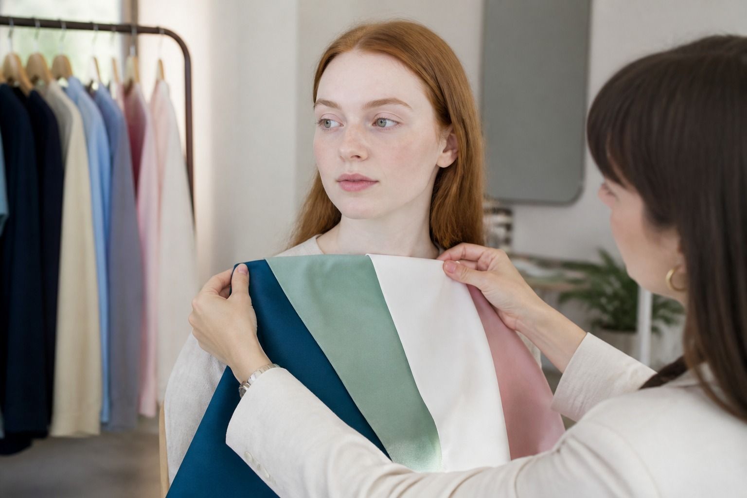
For a useful Soft Winter colour analysis, set up the test so the colour is doing the talking. Work near a window in indirect daylight, remove strong makeup, and wear a neutral top that does not reflect pink, yellow, or green onto the chin. Keep the camera filter off if you take photos.
Start with pairs that test one variable at a time. Compare charcoal with black to test severity, ink navy with a lighter blue-grey to test depth, and deep raspberry with dusty rose to test chroma. Place each fabric high on the chest, not over the shoulder, and look for changes below the eyes. The useful signs are quiet ones: the whites of the eyes look cleaner, the jawline appears more even, and the colour stops drawing attention to patches of redness or shadow.
Then test the palette in combinations, because a shade that works alone may be difficult to use. Put blue spruce beside soft white, aubergine beside charcoal, and a berry shade beside ink navy. Soft Winter should support these medium-contrast pairings without requiring a bright white shirt or a pure black anchor. If the outfit looks flat, increase depth or add a clearer berry accent. If it looks hard, soften the lightest colour or replace black near the face with charcoal.
Fabric is part of the evidence. Compare a matte knit, a smooth shirt, and a slightly reflective accessory in a related colour. A heavily brushed surface can make a suitable shade appear too muted, while a glossy surface can make a moderate colour look more vivid than it is. This is why shopping by hex codes or isolated online swatches is unreliable. The same aubergine can move from smoky to electric depending on fibre, finish, and surrounding colours.
Finally, wear the test colour for a normal hour rather than deciding in the first ten seconds. Look at it in a car window, a hallway mirror, and outdoor shade. Notice whether you stop seeing the fabric and start seeing your face, or whether you keep adjusting the collar because the colour feels loud. That is the middle ground to build on.