When people ask, "What is my color palette?" they are usually trying to solve a very ordinary problem: why does one shirt make the face look rested while another seems to drain it? Seasonal color analysis can give you a useful answer, but only if you treat it as a visual comparison rather than a verdict handed down by a quiz. The workable approach is to study undertone, lightness, saturation, and contrast together, test real colors near the face, and keep the shades that make getting dressed easier.
Start with the three color dimensions
A personal color palette is not simply a list of warm or cool paint swatches. Every color has several qualities, and your best shades tend to echo a particular combination of them. The first is undertone: the warm, cool, or relatively neutral cast beneath the surface color. The second is value, which means how light or dark a color is. The third is chroma, or how clear and intense a color appears compared with a softened, gray-mixed version.
Contrast is the relationship between those qualities in your own coloring. Someone with very dark hair, pale skin, and defined eyes may need stronger light-to-dark separation than someone whose hair, skin, and eyes sit close together in value. Contrast is not a separate temperature category, and it does not mean that a person must wear dramatic black and white. It helps explain why the same red can look balanced on one face and overpowering on another.
| Question to ask | Color quality | What it changes in a wardrobe |
|---|---|---|
| Does the shade lean golden, peachy, blue, or pink? | Undertone | Whether warm or cool versions of neutrals and accents look more connected to the face |
| Does the shade look pale, medium, or deep? | Value | How much light-to-dark contrast you can use without the clothing taking over |
| Does the shade look crisp or gently grayed? | Chroma | Whether clear jewel tones or muted, dusty colors appear more natural |
| How different are your hair, eyes, and skin from one another? | Contrast level | Whether an outfit needs sharp separation, close tonal steps, or a mix of both |
This is why a result such as "you are warm" is too broad to shop from. Two warm palettes can differ greatly: one may need light, clear peach and fresh camel, while another may handle deep rust, espresso, and softened olive. Start with the full combination, then name a season only when it helps you organize the evidence.
Check undertone without trusting one shortcut
Undertone is useful, but it is also the part most often over-simplified in a color palette test. Veins that look blue or green, the way a person tans, and whether gold or silver jewelry seems attractive can offer clues, yet none of these is a reliable decision on its own. Vein color is affected by skin depth and surrounding light. A tan changes surface color, not necessarily undertone. Jewelry also reflects personal taste, metal finish, hair color, and the colors already worn around it.
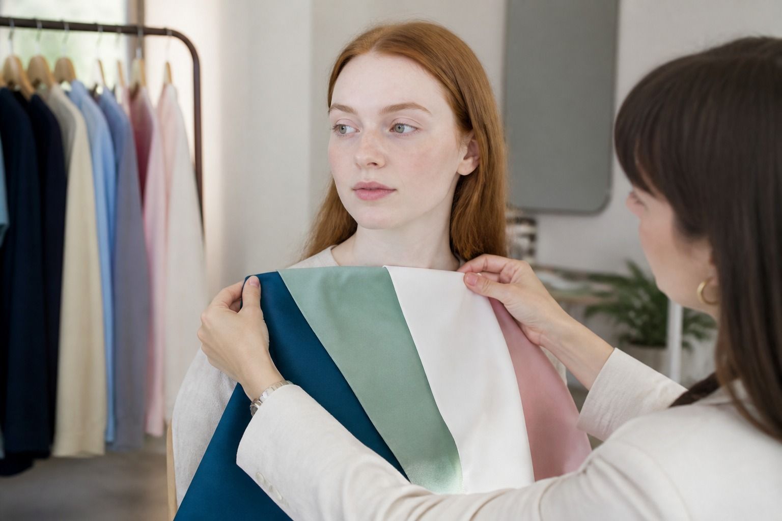
Use a cleaner comparison instead. Stand near a large window during daylight, turn off warm indoor lamps, and place a plain gray or off-white background behind your shoulders. Remove strong makeup if possible and keep your hair away from the face. Hold two fabrics of similar depth under the chin: a warm coral beside a cool berry, a golden beige beside a blue-based gray, or a tomato red beside a raspberry red. Keeping the lightness similar matters; a very dark cool color will often seem more serious than a very light warm one, even before temperature enters the picture.
Watch the skin rather than the fabric. A helpful color can make uneven redness look quieter, reduce a gray cast under the eyes, and let the natural lip color remain visible. An unhelpful one may create a yellow or pink reflection along the jaw, deepen shadows beside the nose, or make the clothing appear to be the first thing you see. These changes are subtle, so compare the fabrics several times and take a short break between groups. The first color that looks attractive to you is not automatically the one that supports your face best.
Do not force a warm-or-cool answer when the evidence is mixed. Some people tolerate both temperatures when the value and chroma are right. A cool blue-gray may work because it is muted and medium in depth, while a very bright icy blue may look too sharp. A warm shade can behave similarly: soft apricot may be easier than electric orange. In practice, temperature is one filter in the palette, not the entire palette.
Compare real colors near your face
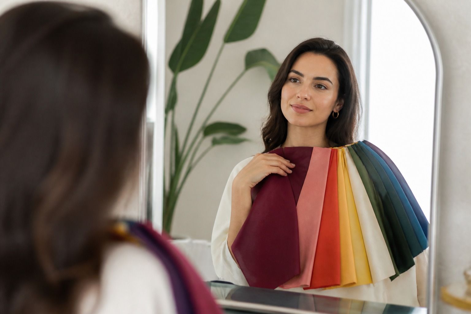
The most useful form of draping is not an elaborate ceremony. It is a controlled comparison using clothing or fabric you can actually buy and wear. Begin with a few pairs that belong to the same color family but differ in temperature or clarity. Keep your shoulders covered with a neutral towel or top, place each color at the neckline, and view it from the same distance. A scarf that sits several inches below the face tells you much less than a crew-neck shirt or folded fabric tucked right under the chin.
Work through the colors in stages. First compare warm and cool versions at a similar depth: peach against dusty rose, camel against cool taupe, warm navy against blue-gray. Next compare light and dark versions: soft white against black, light denim against ink navy, pale sage against forest green. Finally compare clear and muted versions: bright turquoise against softened teal, clean tomato red against brick, vivid violet against smoky plum. The goal is not to find a single winner in every pair. You are looking for repeated behavior.
Use three visual checks for every drape. Look at the area under the eyes: does it seem smoother, or do shadows become more visible? Look at the outline of the face: does the jaw look defined without a gray halo or yellow reflection? Then look at the eyes and lips: do they appear clearer, or does the cloth compete with them? A good shade usually makes these features look more present without requiring extra makeup.
Your hair needs to be part of the observation, but it should not dictate every decision. A recent dye job, highlights, or a very dark wig can change the apparent contrast around the face. If your hair is colored, pin it back for the first round and release it for a second round. This separates the colors that support your skin and eyes from the colors that merely match the current hair. The same caution applies to self-tanner and foundation with a strong yellow, pink, or olive cast.
Photographs can help you remember comparisons, but they are poor judges when used alone. Phone cameras alter white balance, exposure, and skin color, especially beside a bright window. If you take pictures, keep the camera in one place, lock the exposure if possible, and photograph several fabrics in the same session. Use the images to spot a repeated pattern, then confirm the pattern in a mirror under natural daylight before buying a costly coat or changing your hair color.
Build a small wearable palette
Once several comparisons point in the same direction, turn the result into a working wardrobe rather than a large collection of swatches. Choose two or three wardrobe neutrals first. These are the colors that need to support trousers, coats, shoes, knitwear, and bags. Depending on your coloring, they might be soft white, mushroom, camel, chocolate, navy, charcoal, or a softened black. The best neutral is not the one that looks impressive in a color fan; it is the one you can wear repeatedly without noticing a tired reflection in the mirror.
Add two main colors that you would genuinely wear and two accents for smaller areas such as scarves, knit tops, earrings, or lipstick. Keep the same general temperature, value range, and chroma across this first group. For example, a muted palette might combine soft navy, mushroom, dusty blue, muted rose, and eucalyptus. A clearer palette might use crisp ivory, ink navy, clear teal, raspberry, and bright leaf green. Those are starting shapes, not rules. If a color is attractive but difficult to combine, move it to the accent column instead of removing it completely.
Test the palette against your real life. A remote worker may need flattering tops and video-friendly midtones more than a range of formal jackets. Someone who wears denim most days needs to know whether medium blue, dark indigo, or gray denim sits best near the face. If you have a uniform wardrobe of black, ask whether the color itself is the problem or whether the outfit needs a softer neckline, a brighter scarf, or a jacket that creates a more suitable contrast. A personal color palette should reduce awkward purchases, not require replacing every item you own.
Extend the palette by changing one quality at a time. If a muted teal works, try a slightly lighter or darker muted teal before jumping to a vivid turquoise. If deep navy is reliable, test a related blue with similar depth rather than assuming every pale blue will work. This makes shopping more predictable and helps you recognize your boundaries. Colors just outside the palette can still be useful when they are worn away from the face, broken up by a compatible neutral, or chosen for a very small accessory.
Makeup and hair color should follow the same observations, but they deserve their own test. A clothing color can be attractive because it repeats the eyes, while a lipstick must also sit against the natural lip and skin. Begin with the most wearable versions: a blush that does not turn orange or gray, a lipstick that leaves the eyes visible, and a hair shade that does not make the skin look unusually red or dull. Matching a season exactly is less important than keeping the overall temperature, depth, and clarity in balance.
Know when a result needs a second look
A first result is worth revisiting when the evidence is split between two neighboring palettes. That is common, especially when someone has medium contrast, neutral undertone, naturally blended coloring, or hair that has been lightened. Instead of choosing a label because an online quiz demands one, compare the two likely directions directly. Use the same neutral background, the same daylight, and colors with similar value. The question is which group produces more consistently calm, even skin across several comparisons.
Be cautious with online photographs and automatic color palette tests. A phone selfie may have a beauty filter, indoor lighting, edited contrast, or a white balance that pushes the result warm or cool. A quiz can still be a useful way to learn the vocabulary, but it cannot see how fabric reflects onto your jaw. If a digital result says you need very bright colors and your mirror comparisons show that softened colors make the face look clearer, trust the repeated draping evidence and investigate why the image result differed.
Retest after a major change in presentation rather than assuming your coloring has been permanently reassigned. Hair dye, extensive highlights, a new foundation, a strong tan, or a long period of illness can alter what you see at the surface. Your underlying coloring has not necessarily changed, but the contrast and reflections around the face may have. Pinning the hair back and using a bare or lightly made-up face gives you a cleaner baseline.
Finally, judge a palette by the decisions it improves. It should help you choose between two gray sweaters, find a less tiring white shirt, or decide whether a lipstick is too clear or too muted. It does not need to ban a favorite color, predict your personality, or identify one perfect shade. Keep the colors that make your face look settled and your wardrobe easier to combine; keep the rest as optional colors for distance, accessories, or days when personal preference matters more than visual harmony.